Fiat On/Off Ramp
2022 Fiat roadtrip on Binance app Pro

BACKGROUND
Binance fiat service serves the user with the card, cash balance, bank transfer, and e-wallet on/off ramp by providing buy, sell, deposit & withdraw services. Buy Crypto is our main stream and income source.
App Pro brings 70% of fiat users among the three platforms (app Pro, app Lite, and web). However, we found 2 significant problems from the buy on App Pro:
App Pro has the lowest CR (9%) compared to Lite (17%) & Web (22%).
From the user’s feedback, we learned that user is quite hard to find the fiat entrance via app Pro.
Role /
Product Manager | Binance Fiat
Product management, Data analysis, Competitive analysis, Wireframe, Mockup, Usability testing
Team /
1 Product manager (me), 1 UIUX Designer, 10 iOs/Android Devs, 2 backend Devs, 4 QAs, and teams from other BUs
Duration /
5 months
Year /
2022
Product management
The following enhancements involve 4 sprints of development & iteration.
The challenge is communicating between stakeholders and development teams to get an alignment and ensure the development goes smoothly without any fracture.
The first is to present and communicate the proposal to other departments, roll out the plan, get their resources and approval, and complete the ETA implementation on time. Meanwhile, I propose that our backend resource to provide new APIs be flexibly configured to avoid any sudden changes in the future. And due to the resource constraint, we have dissected the ability of the API to meet the timeline, first to provide a default mode and then building an admin panel to configure in detail.
If to talk about anything I would do differently, I'd say to dive deep into the logic & interaction of the APIs to prevent any possible delays.

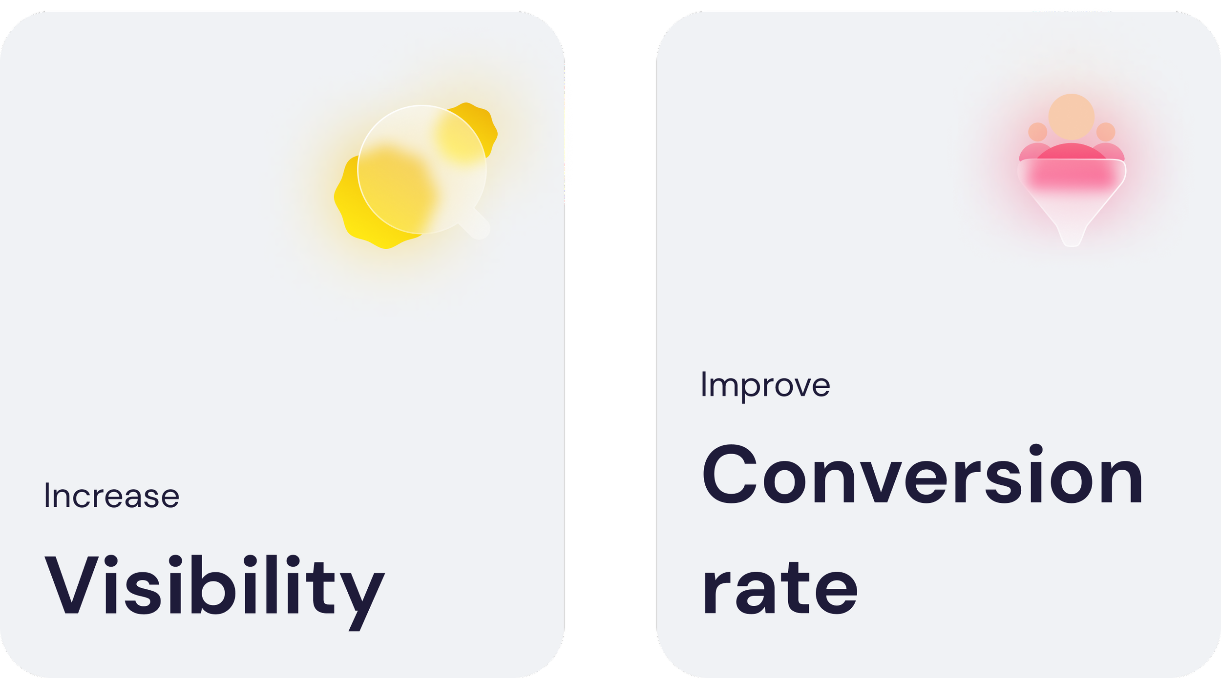
Goal
01
Gain More Traffic
Dig more fiat entrance, provide promotion & payment method exposure in advance
02
Retain the Active Users
To provide promotion exposure
03
Increase the Overall CR
To minimize & accelerate the user journey in the flow
Approaches
To better achieve the goals, I’ve divided into 2 segmentation to implement the enhancement.

1
From user feedback, although we have a big entrance in the home screen, users still need help investing in their first crypto. By analyzing competitor's products and our data, I have narrowed down the following problems:
Lack of entrance in the places where users mostly try to invest:
Based on the user's app experience, the highest volume users most frequently visit is the homepage, Kline, and their wallet.No differentiation between users with assets & with no assets:
Mainly, the users with no assets are frequently identified as new users and need help investing in their first crypto.From the data we collected, compared to deposit & withdraw, buy & sell traffic is relatively low
To Improve the above 3 points, I've made the following proposals and launched them with successful outcomes.
1.1 Adding more entrance
Find possible entries based on the user types & user journeys. (e.g., the user with assets & user without investments)
As a result, the wallet overview (1) & detail page (3) generate huge traffic.
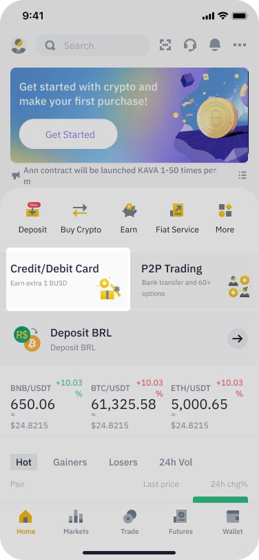
1. Home page
Segment the user with no asset and gives them a clear jump start.

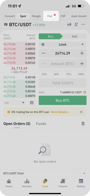
2. K Line
Guide users to buy crypto if it has no assets or insufficient assets.
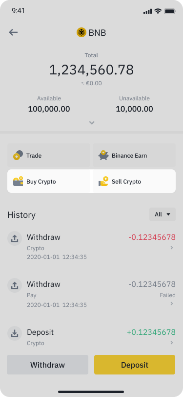
3. Wallet / Coin detail page
Add buy crypto entrance, and sell entry in condition.

4. Pre- expo payment method
Gives user a sense of the options they can make purchase with
1.2 Promotion Exposure
To Provide configurable Promotion exposure on main entries, including title, subtitle, icon, red dots, and promotion tags.
1. Home page / banner
Configurable context (Title, subtitle, and icon) for events usage
2. Trade tab / fiat tab
Configurable red dot for events usage
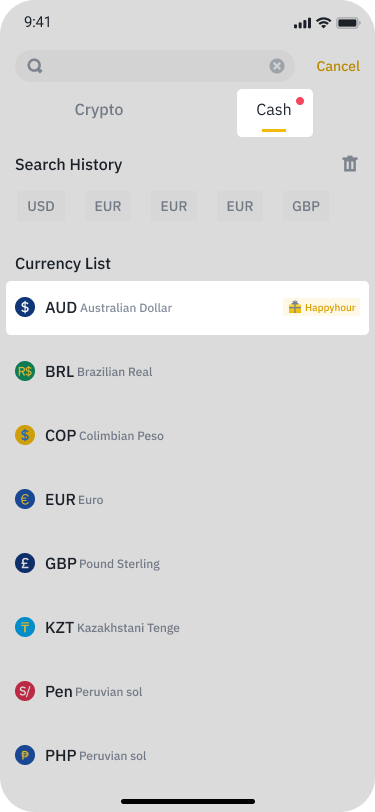
3. Deposit & Withdraw cash tab
Configurable red dot & event tag on certain currency

4. Select payment page
Configurable event tag on each payment method
1.3 Revamp Fiat Tab
We have also revamped the design of the fiat independent page to gain active users and retain our active users:
Retain Active User
Increase user engagement by providing daily task & event sectionUp Front Payment Ability
Let users sense the payment methods in advance

2
First, we get more traffic and must improve the overall CR. From the data, we learned that compared to Lite and web for the past 6 months, the CR of app Pro is relatively low and flat. By analyzing the competitors’ products and our current flow, I have generated the following main changes:
Shorten user journey from 4 steps ➡️ 3 steps.
Enhance the purchase experience.
2.1 Shorten the user flow
From the data, we’ve learned that the highest drop comes from step 1: select the cryptocurrency page
Learned from the success metric from wallet entrance, it generated higher CR because the user has specific agenda to invest more assets.
As a result, we skipped the step and merged it into the enter amount page by providing the default currency.

2.2 Enhancements of overall buy crypto flow
To skip the select crypto page, and give a suggested crypto (e.g. default USDT when first purchase & present the crypto user successful purchase last time)
From data, we learn that 60% of user will try with minimum amount. To provide Min & Max buttons to accelerate the process.
To provide auto adjustment of the available amount to proceed to next step
To provide clean & clear information to proceed to next step
We did several iterations to improve the overall flow. Combined with the data analysis, we successfully increased the overall CR by 14% in the bearish market in Q3 & Q4 2022.

Accelerate & Auto-correct
From data, we learn that 60% of user will try with minimum amount

Auto-suggestion
Give the user a clear suggestion and reduce the jumping back and forth for amount correction
Redefine & Prioritize
the hierarchy of the information display & recommended channel with promotion tagRedesign
the hierarchy of the information display 2.3 Refinements of pages in detail
To highlight the most critical information:
More intuitive quotation. The enhancement allows the user to see the final amount and compare.
Clear information display for payment selection.
Since we have the auto-suggestion logic, the user can automatically switch the available amount to proceed.
The 10s countdown of the CTA tries to hurry the user to decide out of lots of information. The enhancement reduces the stress of making a decision.
To have better guidance on the confirm order page. We have specified adjusting each field's definition to have an understandable result.


Takeaways
Overall for the constant iteration, we’ve got the fruitful results.
The New added entrances of the wallet became the top 3 entrance of fiat, nearly half traffic coming from these entrances.
The CR of buy crypto flow increases 14% over the bearish market.
